
Showing posts with label Renaissance by Design. Show all posts
Showing posts with label Renaissance by Design. Show all posts

Well, this Sunday brings you my last Curtain Call Color Challenge, courtesy of Stacey's Stamping Stage. It has been a fun 6 months, and I am sure I will continue participating!! Without further ado, here are the colors for this week:
And here is what I came up with for the week. The brown is a bit darker than the sample...but it was all I had that would work!


"We Can All Twinkle" supplies:
Cardstock: Bazzill Basics
Paper: My Mind's Eye & Bo Bunny
Stamps/Ribbon: Renaissance by Design (Roots and Wings, Roots and Wings add-on)
Ink: Clearsnap (Pigment: moss green, eggplant, chestnut)
Pearls: Kaiser Craft
Button: craft supply
Twine: Darice Inc.
Corner Rounder: EK Success
Scalloped Die: Papertrey Ink
Diecut Machine: Cuttlebug by Provo Craft
Instructions: Fold green cardstock in half to make your card base, and round the bottom corners. Round the bottom corners of a brown damask paper block, and adhere to the front of the card. Cut a scalloped border to the top of a purple dot paper block using a Cuttlebug. Stamp the tree and sentiment to cream cardstock, and adhere to the purple block. Tie ribbon around the seam, and adhere a button to the bow with twine. Adhere the entire block to the front of the card, and then accent with brown pearls.
And don't forget to check out what the rest of the gals came up with this month!! ♥♥♥

Happy Sunday everyone! Wow...I feel like I have been completely MIA lately! And I actually pretty much have been. The past two weeks all of my posts have been scheduled, and they were scheduled about 3 weeks ago. I was gone for our fun "Hocker Girls Week" the week before last, and this past week I have just been busy with some other projects. I haven't been able to visit my favorite blogs, and didn't even really see any posts from CHA...so I feel a little out of the loop! I will catch up though...I always do!
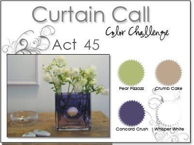
Well, after a needed week off....this Sunday gets back on schedule with Curtain Call Color Challenge 42 courtesy of Stacey's Stamping Stage blog! Here are the colors for the week!
Along with using these fabulous colors, I also used Clean & Simple: 102 for it. Love this fun sketch that they created this week....as always! :)
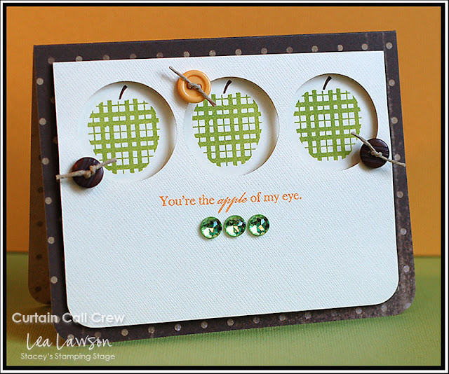
Well, after a needed week off....this Sunday gets back on schedule with Curtain Call Color Challenge 42 courtesy of Stacey's Stamping Stage blog! Here are the colors for the week!


"Apple of my Eye" supplies:
Cardstock: Bazzill Basics
Paper: Glitz Designs
Stamps: Renaissance by Design (A is for Apple, Roots & Wings add-on)
Ink: Clearsnap (Pigment: moss green, chestnut, topaz)
Jewels: Doodlebug Designs
Buttons: Basic Grey
Twine: Darice Inc.
Corner Rounder: EK Success
Instructions: Fold brown dotted paper in half to make card base, and round the bottom corners. Round the bottom corners of a vanilla cardstock block, and punch three circles to the top of it. Stamp the sentiment to the middle of the cardstock block, below the punched circles. Stamp the apples to a separate cardstock strip, and adhere it to the front so the apples will show through the punched circles. Adhere the punched block to the front of the card using dimensional adhesive. Tie twine through 3 buttons, and accent the circles with them. Finish by adding three jewels below the sentiment.
Be sure to check out what the other ladies came up with, including our fabulous August guest designer! And I sure hope that you will play along! ♥♥♥

This is such a beautiful color combination....perfectly complimenting each other. The OTWC #16 challenge happens to be these colors...so I decided to make a few cards for it. I also did them with the "Classy & Elegant" Moxie Fab challenge in mind.
My first card features this beautiful chandelier stamp. And while the colors are non-traditional, this would make a beautiful Valentine for someone special. I think it would also be great for anniversaries, weddings, and any love occasion you can think of.


My first card features this beautiful chandelier stamp. And while the colors are non-traditional, this would make a beautiful Valentine for someone special. I think it would also be great for anniversaries, weddings, and any love occasion you can think of.

"Be Mine...Always & Forever" supplies:
Cardstock: Bazzill Basics
Paper: My Mind's Eye
Stamps: Gina K Designs (Fine Furnishings set)
Ink: Clearsnap (Pigment: antique pewter)
Rub-ons: Basic Grey (be mine) & Creative Imaginations (always & forever)
Ribbon: Renaissance by Design
Flowers: Zva Creative
Pearls: Kaiser Craft
Border Punch: Fiskars
Instructions: Fold gray cardstock in half to make card base. Adhere rub-on sentiments to the bottom of a white cardstock block. Stamp the chandelier to the middle of the white cardstock block, and accent with pink pearls. Adhere a bow to the top of the chandelier, and accent the middle with white paper flowers. Punch two border strips from pink dotted paper, and adhere to each side of the white cardstock block. Adhere the entire block to the front of the gray card base using dimensional adhesive.
I am not sure if it is because I have either photographed or attended some weddings recently, but I have been in a wedding card making mood lately! Love must just be in the air, or something. Tee hee!

"I Do" supplies:
Cardstock: Bazzill Basics
Stamps: Renaissance by Design (Darling Damask set)
Ink: Tsukineko (Chalk: pixie dust)
Ribbon: Michael's brand
Flowers: Recollections
Pearls: Kaiser Craft
Corner Rounder: EK Success
Diecut Machine: Cricut Expression by Provo Craft
Diecut Cartridge: Tie The Knot by Provo Craft
Instructions: Fold pink cardstock in half to make card base, and round the bottom corners. Round the bottom corners of a white cardstock block, and stamp a damask pattern to the front of it. Tie ribbon around the top, and accent the middle of the bow with paper flowers. Adhere the white cardstock block to the front of the card. Cut the tag at 2 1/4" using the Cricut Expression and Tie The Knot cartridge. Cover the back of the tag with pink cardstock, and adhere it to the front of the card, tucking the top part underneath the bow. Accent the three damasks underneath the tag with pearls.
This card could be used for so many different purposes. It would make a wonderful graduation card for a young woman graduating from any type of school. It would be great for someone who recently got a new job or a promotion. It could also just serve as an encouragement card for someone. So many great reasons to send a card with a sentiment like this!

"Success & Dreams Come True" supplies:
Cardstock: Bazzill Basics
Paper: My Mind's Eye
Stamps: Papertrey Ink (A Little Argyle & For The Graduate sets)
Ink: Tsukineko (Chalk: pixie dust) & Clearsnap (Pigment: antique pewter)
Ribbon: Webster's Pages (bloomers)
Pearls: Kaiser Craft
Corner Rounder: EK Success
Instructions: Fold gray cardstock in half to make card base, and round the bottom corners. Stamp an argyle pattern to a white cardstock block. Cover the top and bottom with pink dotted paper, and round the bottom corners. Adhere bloomers ribbon right above the argyle pattern, and adhere the entire block to the front of the card. Stamp the sentiment above the bloomers, and then accent the card with pink & silver pearls.
This is the lovely inspiration photo that was posted on the OTWC blog. Hmmm...maybe that is part of where I got the wedding inspiration. Tee hee!

This is the lovely inspiration photo that was posted on the OTWC blog. Hmmm...maybe that is part of where I got the wedding inspiration. Tee hee!

How about a movie post? I haven't done one of those in a little while! Here is what we have watched recently:

REALLY loved Invictus. And even though I am going to Kenya, and not South Africa....it made me even more excited for the mission trip. Very inspiring and amazing movie. Valentine's Day was HILARIOUS. We both laughed so much...especially at the Taylor/Taylor scenes. They made the whole movie. And When in Rome was okay. Not my favorite movie of all time, but cute enough. I won't ever watch it again....but it was cute enough to watch once.
Well, there you have it. Cards and movie info...hope that you have enjoyed the post!
Until later,
~Lea

Well, it isn't Sunday...but I am bringing my color challenge card to you on Monday instead! I just had a super busy weekend...I mean, SUPER BUSY, and was behind on pretty much everything craft related. So, here is the color challenge courtesy of Stacey's Stamping Stage blog.
Love the fabulous earth tones that Stacey chose for this week!! I also used Clean & Simple Sketch 99 for my card....which was perfect for the stamping that I wanted to do!! Here is my card!

Instructions: Fold kraft cardstock in half to make card base, and round the right side corners. Round the right side corners of a white paper block, and adhere a strip of ribbon to the left side. Stamp the tree layers and sentiment to it, and accent with green pearls. Adhere the white paper block to the front of the kraft card using dimensional adhesive.
Don't forget to check out what the other gals came up with this week!! ♥♥♥

 My busy weekend was all about Casey, and football! He played in the East West Shrine game in Butte, which is an all-star game that chooses the best of the best players from all classes and benefits Shriner's hospitals. We had the banquet on Friday night, a parade on Saturday morning, and the game on Saturday night. He played on the West team, and they won 34-18! Casey was put at a wide receiver spot, and he played a little on special teams. He was only thrown the ball once, and it was in the 4th quarter. But let me tell you...the kid capitalized on that one pass....and he ran it down field for a 91 yard touchdown!!! Which also broke a Shrine game record...so his name will be in the record books as well. SO proud of him! His recruiting coach from Carroll happened to be at the same end of the field that Casey scored, so we were very excited that he was able to see it! Casey had an amazing week with players from all over the state in all of the different classes (Class C-Class AA). And a lot of money was raised for the Shrine Children hospitals. It was a really great weekend!
I hope your weekend was as great as mine! I will be back tomorrow for Taylored Expression's Blast From the Past blog hop! I hope you will come back and check it out!!
Until later,
~Lea L.


"Eternal Summer..." supplies:
Cardstock: The Paper Company
Stamps: Renaissance By Design (Roots & Wings, Roots & Wings add-on) & Papertrey Ink (Through The Trees)
Ink: Clearsnap (Pigment: chestnut, fresh green, dune & Chalk: ice jade)
Ribbon: Renaissance by Design
Pearls: Kaiser Craft
Corner Rounder: EK Success
Instructions: Fold kraft cardstock in half to make card base, and round the right side corners. Round the right side corners of a white paper block, and adhere a strip of ribbon to the left side. Stamp the tree layers and sentiment to it, and accent with green pearls. Adhere the white paper block to the front of the kraft card using dimensional adhesive.
Don't forget to check out what the other gals came up with this week!! ♥♥♥


I hope your weekend was as great as mine! I will be back tomorrow for Taylored Expression's Blast From the Past blog hop! I hope you will come back and check it out!!
Until later,
~Lea L.

Yep- I have some more cards for the Moxie Fab card style week. So, let's get right to it!
These next two cards are for the "Shabby & Vintage" Style Challenge at Moxie Fab. This first one is also my card for CPS Sketch 175 this week! Here is how Cath describes shabby & vintage...which is definitely NOT my strong style. It is characterized by layering. It is soft, utilizing ribbon, lace and techniques like inking and distressing. I will admit...both of my cards are probably considered a "clean" version of the shabby style.


These next two cards are for the "Shabby & Vintage" Style Challenge at Moxie Fab. This first one is also my card for CPS Sketch 175 this week! Here is how Cath describes shabby & vintage...which is definitely NOT my strong style. It is characterized by layering. It is soft, utilizing ribbon, lace and techniques like inking and distressing. I will admit...both of my cards are probably considered a "clean" version of the shabby style.


"Remembering" supplies:
Cardstock: Prism
Paper/Chipboard: Prima
Paper Frill: Doodlebug Designs
Flowers: Prima
Ribbon: Renaissance by Design
Jewels: Glitz Designs
Glitter: DecoArt
Ink: Ranger Distress ink
Corner Rounder: EK Success
Paper/Chipboard: Prima
Paper Frill: Doodlebug Designs
Flowers: Prima
Ribbon: Renaissance by Design
Jewels: Glitz Designs
Glitter: DecoArt
Ink: Ranger Distress ink
Corner Rounder: EK Success
Instructions: Fold cream cardstock in half to make card base, and round the bottom corners. Round the bottom corners of an aqua dot paper block, and adhere to the front of the card. Ink a white strip of tiny scalloped paper flair, and adhere to the bottom of a pink paper strip. Adhere the entire strip to the lower section of the card. Layer two pieces of glittered chipboard to the left side of the paper strip, and accent with a jewel flourish. Glitter an aqua flower and adhere to the top of the chipboard accent. Add a strip of ribbon and bow to the top of the flower, and accent with two paper roses.
This next card is still for the Shabby & Vintage style challenge, and it also uses Paulina's sketch for the Practicing Creativity Sketch Challenge.

"Enjoy Life" supplies:
Cardstock: Bazzill Basics
Paper: Prima & My Mind's Eye
Stamps/Ribbon: Renaissance by Design (Enjoy Life, Darling Damask sets)
Ink: Tsukineko (Chalk: pixie dust)
Flowers: Prima
Button: craft supply
Pearls: Kaiser Craft
Twine: Darice Inc.
Corner Rounder: EK Success
Border Punch: Fiskars
Diecut Machine: Cricut Expression by Provo Craft
Diecut Cartridge: Storybook by Provo Craft
Instructions: Fold white cardstock in half to make cardbase, and round the bottom corners. Punch a border to pink houndstooth paper, and adhere to the top of an aqua dotted paper block. Adhere the entire block to the front of the card. Tie ribbon around the seam, and adhere a button to the bow using twine. Stamp the damasks directly below the paper block, and accent with pearls. Cut the scalloped oval at 2 1/2" from pink dotted paper using the Cricut Expression and Storybook cartridge. Adhere the scalloped oval to the upper right corner of the card. Cut the regular oval at 2" from white cardstock. Stamp the butterfly sentiment to it, and accent the left wing with pearls. Adhere the oval on top of the scalloped one using dimensional adhesive. Accent the leftover white space on the stamped oval with three paper flowers.
These next two cards were done for the "Classy & Elegant" Style Challenge at Moxie Fab. This first one is also based on Alice's sketch for the Practicing Creativity Sketch Challenge. Here is Cath's description for Class & Elegant. A shiny finish, sparkling embellishments, a rich color scheme, and sophisticated sentiment treatments are all part of the classy and elegant pedigree. Its look is regal, stunning, and dashing. And while its lines are clean, sweeping, and dramatic, it can also incorporate monochromatic color schemes with layered textures that awe and impress equally as well.

"On Your Wedding Day" supplies:
Cardstock: Bazzill Basics
Paper: Crafty Secrets & My Mind's Eye
Stamps/Ribbon: Papertrey Ink (YOF: Roses set)
Ink: Clearsnap (Pigment: raven black, evergreen, magenta)
Lace: Making Memories
Jewels: Kaiser Craft
Glitter: DecoArt
Colored Pencil: Heidi Swapp
Corner Rounder: EK Success
Border Punch: Fiskars
Diecut Machine: Cricut Expression by Provo Craft
Diecut Cartridge: Storybook by Provo Craft
Instructions: Fold cream cardstock in half to make card base, and round the bottom corners. Punch a border to a pink dot paper strip, and adhere to the top of a black diamond paper block. Adhere black lace around the seam. Round the bottom corners of the block and adhere to the lower part of the card. Cut the black cardstock label at 4" using the Cricut Expression and Storybook cartridge. Cut the cream cardstock label at 3 3/4" and adhere on top of the black layer. Stamp the rose and sentiment to the cream label, and color in the rose stem. Stamp the rose to pink dotted paper, cut it out and cover in glitter. Piece the cut rose to the stamped rose on the cream label, and accent with jewels. Adhere the entire stamped label to the right side of the card using dimensional adhesive. Tie a bow from green ribbon, and adhere right below the sentiment.
This last card is still for the Classy & Elegant style, and it also uses the Waltzingmouse sketch #5...the second time using that sketch this week. It is a goodie! We had a wedding to attend last night, and this is the card that I made to go with their gift. It matched the wrapping paper perfectly....tee hee! Love it!

"On Your Wedding Day" supplies:
Cardstock: The Paper Company
Paper: My Mind's Eye
Stamps: Gina K Designs (Lovely Labels set) & Papertrey Ink (YOF: Roses set)
Ink: Clearsnap (Pigment: raven black, amber satin, moss green, magenta)
Pearls: Kaiser Craft
Glitter: Deco Art
Colored Pencil: Heidi Swapp
Embossing Machine: ScorPal
Instructions: Fold cream cardstock in half to make card base. Dry emboss two lines to the bottom of the card using a Scorpal. Stamp the label to the front of the card, and them stamp the roses on top of the label. Color in the stem of the roses with a colored pencil. Stamp two roses to pink dotted paper and cut out. Cover them both in glitter, and then piece on top of the stamped roses. Accent the roses and the lower right corner with pearls.
Those are all the cards I have to share with you today!! I hope you enjoyed them...I know I posted quite a few. And this is where my post ends today, as I have some things I need to go and get done!! Have a good one! ♥♥♥
Until later,
~Lea
~Lea

Happy Sunday everyone!! Of course, Sunday means that I have a new color challenge to share with you courtesy of Stacey's Stamping Stage blog! Here are the colors this week:
Here is my card using these fabulous pastel colors! It is also based on Waltzingmouse Sketch #5, which is a pretty awesome sketch! Be sure to check it out!


"You're The Best" supplies:
Cardstock: Bazzill Basics
Paper: Papertrey Ink, My Mind's Eye, October Afternoon
Paper Flair: Doodlebug Designs
Stamps/Ribbon: Renaissance by Design (Blossom & Wilt, Darling Damask)
Ink: Clearsnap (Pigment: heliotrope, amber, raven black & Chalk: rose coral)
Jewels: Darice Inc.
Corner Rounder: EK Success
Border Punch: Fiskars
Instructions: Fold vanilla colored cardstock in half to make card base. Round the corners of a pink leaf paper block, and adhere to the front of the card. Punch a border to a light orange cardstock strip, and adhere a green dotted paper strip to the top of it. Adhere the strip to the bottom of the card. Round the corners of a vanilla cardstock block and stamp the frame & sentiment to the top of it. Adhere the block to the front of the card. Add green patterned paper to the bottom of the block, and an orange scalloped paper right above it. Adhere ribbon over the seam. Stamp the flowers and leaves to vanilla cardstock, and cut out. Adhere to opposite corners of the stamped frame, and accent with jewels.
Be sure to check out what the other ladies came up with too! I know it will be pure inspiration! ♥♥♥
I got a few new dresses at Target the other day! I was browsing through the clearance sections, and they had a whole rack of dresses that were 75% off. So, I started looking through the small section, and they had quite a few cute ones left! They are dresses that I will also be able to wear while I am in Africa, and get this....I got them for $5.48 each!! Such a deal. I could only find images for two of the dresses online, so here they are:
 The other dress is dark blue, black & white, with a v-neck cut and hits me a little past my knees. It is a very light cotton, and nice and flowy. The first dress up there hits me at my knees, so it will be appropriate on my trip. If it hit me the way it did on the model....there is no way I would take it with me. But, being short.....it is much longer on me. Tee hee!! I will wear tops with at least cap sleeves either underneath or over top the dresses while in Africa. We will be able to wear capris or pants while we are in the orphanage and on the mini safari....but when working in schools/churches or in the cities....we need to wear dresses or skirts. So- I am trying to get prepared while things are inexpensive!!
Well, that is everything I have to share today! I hope that you have had a fabulous weekend!! We had friends over for steaks, parmesan baked red potatoes and grilled veggies last night. We sat out on the back deck and chatted while we ate...it was so nice! Then us girls ran and got TCBY for everyone for dessert. So yummy!!
Until later,
~Lea

Well, that is everything I have to share today! I hope that you have had a fabulous weekend!! We had friends over for steaks, parmesan baked red potatoes and grilled veggies last night. We sat out on the back deck and chatted while we ate...it was so nice! Then us girls ran and got TCBY for everyone for dessert. So yummy!!
Until later,
~Lea

Happy Tuesday everyone!! I hope that your week has been a good one so far! I am officially finished editing wedding photos, and am now just waiting for the couple to let me know they are back from their honeymoon. I don't want to post anything online until I know they are able to see them as well...but I have my favorites all ready to blog, and add to my photography page on Facebook. I am so happy with how the images turned out!
Before I get to some cards, I wanted to let you know that I have posted some peeks of the two latest Glitz Designs collections which will be releasing at CHA this summer. Check them out in THIS POST on the blog. I am honestly swooning over these two collections...they are AMAZING!
Now, I have a few cards to share with you today! First up is my card for sketch 173 at CPS this week. It is such a great sketch, with so many different possibilities. I decided to go all sweet and cute with this one...{sigh}. I still love using these Doodlebug stickers.
Before I get to some cards, I wanted to let you know that I have posted some peeks of the two latest Glitz Designs collections which will be releasing at CHA this summer. Check them out in THIS POST on the blog. I am honestly swooning over these two collections...they are AMAZING!
Now, I have a few cards to share with you today! First up is my card for sketch 173 at CPS this week. It is such a great sketch, with so many different possibilities. I decided to go all sweet and cute with this one...{sigh}. I still love using these Doodlebug stickers.

"Thanks for your Sweetness" supplies:
Cardstock: Bazzill Basics
Stickers: Doodlebug Designs (glittered shapes) & Making Memories (alphas)
Jewels: Doodlebug Designs
Corner Rounder: EK Success
Embossing Machine: Cuttlebug by Provo Craft
Embossing Folder: Swiss Dots by Provo Craft
Stickers: Doodlebug Designs (glittered shapes) & Making Memories (alphas)
Jewels: Doodlebug Designs
Corner Rounder: EK Success
Embossing Machine: Cuttlebug by Provo Craft
Embossing Folder: Swiss Dots by Provo Craft
Instructions: Fold white cardstock in half to make card base, and round the bottom corners. Emboss the front of the card using a Cuttlebug machine and Swiss Dots embossing folder. Round the bottom right corner of a white cardstock block, and adhere to the right side of the card. Add three scallop circle glitter stickers to the left side of the card. Adhere the scalloped edge sticker to the left side of the cardstock block, and adhere the gumball machine using dimensional adhesive. Accent the gumball machine with pink jewels, and a heart sticker. Add the sentiment below the gumball machine, and accent the top with a row of hearts.
This next card is based on Etsy Inspired Challenge #94. This week's featured Etsy store is Sand Box Studio, and I was inspired by this adorable tote bag in her shop. I loved the whimsical feel of it, and the flowers on the tree branch. I changed up the colors, and used a nest of eggs instead of birds...but I think you can definitely tell that I was inspired by it!

"Multiple Congratulations" supplies:
Cardstock: Bazzill Basics
Stamps: Papertrey Ink (Inside & Out: Baby)
Ink: Clearsnap (Pigment: raven black, aqua)
Ribbon: Renaissance by Design
Flowers: Prima & Zva Creative
Jewels: Kaiser Craft
Glitter: DecoArt
Corner Rounder: EK Success
Diecut Machine: Cricut Expression by Provo Craft
Diecut Cartridges: Straight from the Nest & Give A Hoot by Provo Craft
Instructions: Fold white cardstock in half to make your card base, and round the bottom corners. Stamp the sentiment to the top using black and aqua pigment ink. Cut the branch and its layers using the Cricut Expression and Straight from the Nest cartridge. Layer together, and adhere to the bottom of the card. Accent the flowers with jewels. Cut the nest and its layers using the Cricut Expression and Give A Hoot cartridge. Adhere the nest cuts to the front of the card, using dimensional adhesive on the top layer. Glitter the egg cuts, and add them to the middle of the nest cut. Tie a bow with dotted ribbon, and adhere to the lower left corner of the nest. Accent the middle of the bow with three paper flowers.
This next card is a hybrid of two sketches that are a little bit similar. Hopefully that is okay! I used CardPatterns Sketch 70 and OCC Sketch 21...and took bits from each one. You have seen this stamp and sentiment before in a blue and yellow card...I loved it so much that I also wanted to make it in pink and yellow. I love how they are similar, but different at the same time!!

Instructions: Fold yellow cardstock in half to make cardbase. Cut a pink dotted paper block and and adhere to the front. Punch a scalloped border to the bottom of a yellow paper block and adhere to the front. Stamp the tree images and sentiment to a white cardstock block and adhere to the front. Layer the yellow paper frill and a strip of small pink dot paper right below the stamped block. Add yellow vintage lace and ruffled pink ribbon to the front. Accent the stamped image and the right scallops with pearls.
And I am honored about this, because I know a ton of people participate in the sketch challenges every week:
 The card in this post was part of the Taylored Expressions TESC117 top crops! Yay for blog awards today!! Tee hee! Thanks Taylor and team!
Now I would like a little feedback from you. I have been contemplating turning my blog background to black. While I love the freshness of the white, I shoot with Nikon. And it is well known in the photography world that Nikon images look better backed in black, and Canon images look better backed in white (I will spare you the technical details of why this is. It is just a bunch of photography jargon that I am sure you aren't interested in. Tee hee!). It was proven to me over again when I did a little post on the Glitz blog this weekend, and saw my images on an all black background. Check it out, and you will see what I mean. I know that it is completely my decision, but it is a really drastic decision...and I do like to have opinions from those that regularly read my blog. So- let me know what you think, kay? ETA: It is pretty apparent that I didn't wait for too much feedback. I just went ahead and changed it because the black makes my images look so much better. Glad I know a little about HTML, because I hate the new template editor.
So- how about a movie post? Here is what we have watched in the past couple weeks:
 My thoughts? The Tooth Fairy was silly, but very cute. Kids will love it. My husband...not so much. He is such a sport! Edge of Darkness has some really graphic violence in it...so much so that I had to turn my head a bit. The story line was good though. I really enjoyed extraordinary Measures, and the ending made me tear up with happiness. And I really loved Remember Me. The ending is heart wrenching though, so just be aware of that. So, you all know that I am a Twilight lover- but I am not one of those obsessed fans. So, no- I didn't just see Remember Me for Robert Pattinson. But I do have to say- he is a really good actor. He did an amazing job with this role, and his non-British accent is getting better! Tee hee! So, if you have seen any of these, or do see them...let me know what you think!
Well, I need to get going for now. I hope that you have a wonderful Tuesday! ♥♥♥
Until later,
~Lea
This next card is a hybrid of two sketches that are a little bit similar. Hopefully that is okay! I used CardPatterns Sketch 70 and OCC Sketch 21...and took bits from each one. You have seen this stamp and sentiment before in a blue and yellow card...I loved it so much that I also wanted to make it in pink and yellow. I love how they are similar, but different at the same time!!

"We Can Twinkle" supplies:
Cardstock: Bazzill Basics
Paper:: GCD Studios & My Mind's Eye
Paper Frill: Doodlebug Designs
Stamps: Renaissance by Design (Roots & Wings, Roots & Wings Add-on)
Ink: Clearsnap (Pigment: dusty plum, dune & Chalk: rose coral) and Tsukineko (Dye: dandelion)
Pearls: Kaiser Craft
Border Punch: Stampin Up
Lace: vintage
Ribbon: Chatterbox
Paper:: GCD Studios & My Mind's Eye
Paper Frill: Doodlebug Designs
Stamps: Renaissance by Design (Roots & Wings, Roots & Wings Add-on)
Ink: Clearsnap (Pigment: dusty plum, dune & Chalk: rose coral) and Tsukineko (Dye: dandelion)
Pearls: Kaiser Craft
Border Punch: Stampin Up
Lace: vintage
Ribbon: Chatterbox
Instructions: Fold yellow cardstock in half to make cardbase. Cut a pink dotted paper block and and adhere to the front. Punch a scalloped border to the bottom of a yellow paper block and adhere to the front. Stamp the tree images and sentiment to a white cardstock block and adhere to the front. Layer the yellow paper frill and a strip of small pink dot paper right below the stamped block. Add yellow vintage lace and ruffled pink ribbon to the front. Accent the stamped image and the right scallops with pearls.
And I am honored about this, because I know a ton of people participate in the sketch challenges every week:

Now I would like a little feedback from you. I have been contemplating turning my blog background to black. While I love the freshness of the white, I shoot with Nikon. And it is well known in the photography world that Nikon images look better backed in black, and Canon images look better backed in white (I will spare you the technical details of why this is. It is just a bunch of photography jargon that I am sure you aren't interested in. Tee hee!). It was proven to me over again when I did a little post on the Glitz blog this weekend, and saw my images on an all black background. Check it out, and you will see what I mean. I know that it is completely my decision, but it is a really drastic decision...and I do like to have opinions from those that regularly read my blog. So- let me know what you think, kay? ETA: It is pretty apparent that I didn't wait for too much feedback. I just went ahead and changed it because the black makes my images look so much better. Glad I know a little about HTML, because I hate the new template editor.
So- how about a movie post? Here is what we have watched in the past couple weeks:

Well, I need to get going for now. I hope that you have a wonderful Tuesday! ♥♥♥
Until later,
~Lea

Today I am going to challenge you to do something that might not come quite naturally. I often get comments from people about how adventurous I am when it comes to adding items feminine in nature to my masculine themed cards. While I welcome the title of "risk taker"...I don't necessarily think that items like jewels and ribbon are feminine in nature. Big frilly bows, pink hearts and flourishes of jewels everywhere....those are very feminine.
The key to using these items on a masculine card is to first pick colors and shapes that are suitable for the male receiving your card. Colors and shapes like these work out great:
Shades of green, orange, and yellow would also be great color choices.
The other thing to remember when using items like these on a masculine card.....less is more. Crisp and clean lines, and simple rows of jewels work best when trying to keep the card from leaning towards the feminine side.

 I know...I am totally teasing you by showing two little clips from my cards!! So, without further ado....here are my father's day themed cards using jewels (& ribbon!!). Notice that they are completely appropriate to give to a man, jewels and all.

 So, go ahead and add some jewels to your masculine themed cards!
Until later,
~Lea
The key to using these items on a masculine card is to first pick colors and shapes that are suitable for the male receiving your card. Colors and shapes like these work out great:

The other thing to remember when using items like these on a masculine card.....less is more. Crisp and clean lines, and simple rows of jewels work best when trying to keep the card from leaning towards the feminine side.


Until later,
~Lea

Hey everyone! I hope this Tuesday morning is a good one for you so far! I am preparing for a wedding that I am photographing on Saturday. Making sure my equipment is all ready to go....getting some inspiration from my favorite wedding photographers across the country...planning out what I am going to wear....all that fun stuff. I am so excited to photograph this wedding! The couple has put so many wonderful details into the day, and the main area we will be doing their formal portraits in has kind-of a Secret Gardenish feel to it....it is going to be fabulous! Everything is going to be outdoors, and we are slated for a 30% chance of thunderstorms...so I am just praying that no matter the weather, this wonderful couple gets their perfect day.
I have a couple of cards to share with you today! First up is my card for CPS Sketch 171. How CA-UTE are those glittered lemon and lime slices?!! I just adore them! This is a newer Renaissance by Design stamp set...and I just love it! The sentiment is just something that I randomly typed up. I don't think I have ever heard it anywhere before....but I'm not totally sure. So- I am not going to completely take credit for it, but it sure is a cutie of a sentiment. I kind-of like it! ♥


I have a couple of cards to share with you today! First up is my card for CPS Sketch 171. How CA-UTE are those glittered lemon and lime slices?!! I just adore them! This is a newer Renaissance by Design stamp set...and I just love it! The sentiment is just something that I randomly typed up. I don't think I have ever heard it anywhere before....but I'm not totally sure. So- I am not going to completely take credit for it, but it sure is a cutie of a sentiment. I kind-of like it! ♥

"Lemons & Limes" supplies:
Cardstock: Bazzill Basics
Paper: Sassafras
Stamps/Ribbon: Renaissance by Design (Summer Fruits set)
Ink: Clearsnap (Pigment: canary, lime)
Glitter: DecoArt
Jewels: Doodlebug Designs (green) & Westrim Crafts (yellow)
Button: Doodlebug Designs
Font: Century Gothic (MS Word)
Corner Rounder: EK Success
Embossing Machine: Cuttlebug by Provo Craft
Embossing Folder: Pop Culture border by Provo Craft
Paper: Sassafras
Stamps/Ribbon: Renaissance by Design (Summer Fruits set)
Ink: Clearsnap (Pigment: canary, lime)
Glitter: DecoArt
Jewels: Doodlebug Designs (green) & Westrim Crafts (yellow)
Button: Doodlebug Designs
Font: Century Gothic (MS Word)
Corner Rounder: EK Success
Embossing Machine: Cuttlebug by Provo Craft
Embossing Folder: Pop Culture border by Provo Craft
Instructions: Cover the front of a white card with yellow polka dot paper, and round the bottom corners. Stamp the lemon & lime slices on white cardstock, and cut out. Cover them with glitter, and set aside to dry. Round the bottom corners of a white cardstock block, and print the computer generated sentiment in the lower right corner. Dry emboss a border towards the top of the block using the Cuttlebug & a Pop Culture border folder. Tie ribbon around the top, and add a button to the middle of the bow. Adhere the lemon & lime slices right above the sentiment, popping the lime slice with dimensional adhesive. Accent below the sentiment with three jewels. Adhere the entire block to the front of the card using dimensional adhesive.
This next card uses Card Patterns Sketch 68, which is really great this week! It is also for the latest Embellish Magazine.com challenge (yellow, brown, coral with labels). Here is what I came up with!

"Friendship Grows Here" supplies:
Cardstock: Bazzill Basics
Paper: October Afternoon & Scenic Route
Stamps: Gina K Designs (Lovely Labels set) & Renaissance by Design (Curly Tree set)
Ink: Clearsnap (Pigment: chestnut, & Chalk: yellow cadmium, rose coral, dark brown)
Ribbon: Renaissance by Design
Flowers: Prima
Jewels: Westrim Crafts
Corner Rounder: EK Success
Diecut Machine: Cuttlebug by Provo Craft
Steel Die (large scallop): Papertrey Ink
Instructions: Fold yellow script paper in half to make card base, and ink the edges. Cut a scalloped edge to a brown polka dot paper block, and ink the edges. Adhere the block to the front of the card. Round the corners of two pink paper blocks, and ink the edges. Adhere side by side to the middle of the brown polka dot block. Stamp the label to white cardstock, and cut out. Stamp the sentiment to the middle, and accent with jewels. Tie ribbon around the lower part of the card, and accent the bow with paper flowers. Adhere the label to the front, tucking the lower left corner under the bow.
Josh and I watched these movies in the past week:

I was surprised that I actually liked Alice in Wonderland....but I actually really did! I think they did a great job with it....and Johnny Depp played a great Mad Hatter. Josh was a trooper watching Leap Year with me, because it is more of a chick flick....but I think he liked it as much as he could. I really liked it....and I REALLY want to go to Ireland. :)
Speaking of going places....I made a decision last week that has been about 3 weeks in the making. I am going on a missions trip to Kenya, Africa with a group from my church this coming December for 14 days.

It is a really big decision for me, and one I didn't and don't take lightly. I have never traveled internationally, and it is a pretty large financial commitment....but I really had a strong feeling about going when the church started talking about it. It is a smaller group of people going, which I think will actually be nice. We plan on working in a school for the first few days, and then we head on to an orphanage. One of our pastors and his wife have adopted three sons, and the youngest is from Kenya. The location of his native tribe was recently found, and it has always been in their plan to take him to Kenya to meet his native tribe at some point. So, we will also be traveling to their location and helping with whatever they might need. I am so excited to see what God has planned for us to do on this trip, and selfishly....what He has planned for me to do, and what an amazing impact this will have. I thought I would be terrified at this point....but I have so much peace about going. Now it is time to start raising money, and we will be fundraising all summer long together! I think it is going to be great. I have thought that I might start an Etsy shop and sell my cards to put towards my trip. I already sell cards at my mom's boutique, and Josh's parents are looking for some places to sell them in Texas as well. So- let me know if you think that would be another good way to raise some money. I haven't ever sold anything via the web...so I am just unsure of the whole thing. So- if you could, keep us in your prayers as this trip unfolds over the summer. I am really very excited about it!
Here are a couple of albums that I have been listening to lately:

Loving this new Band of Horses album, even though there has been grumbling that it sounds different from their previous albums. I don't think it sounds that different. Plus- change is inevitable as a band gets more popular and adds more people into the mix. I think it is a great album! The Eclipse soundtrack is still growing on me...I don't think it is as good as the other two. It is still a good album...don't get me wrong, and I will probably like it more once I see where the songs are in the movie. And Band of Horses is on it, which is always a plus in my book! Yay! :)
Well, I think that is everything I have to share with you today!! Thanks for reading all my rambling and randomness....you are wonderful!
Until later,
~Lea

Happy Sunday, my friends!! It is a bright day today, full of sunshine and blue skies! So- I am a happy girl! Of course, Sunday also means it is time for another Curtain Call Color Challenge courtesy of Stacey's Stamping Stage blog! Here are the colors for the week!
There is also a Father's Day theme for this color challenge...which we don't do all to often. But, I think it worked well for these colors. I also used Taylored Expression sketch 117 for my card...it was perfect for what I wanted to do with this card! Here is what I came up with:

We have added a guest designer spot this month! Please help us give her a warm welcome to the Curtain Call!


"Happy Father's Day" Supplies:
Cardstock: Bazzill Basics
Paper: Basic Grey, American Crafts & Little Yellow Bicycle
Ink: Clearsnap (Pigment: amber, merlot, dune & Chalk: tangerine, charcoal)
Jewels: Doodlebug Designs
Border Punch: Fiskars
Instructions: Fold maroon cardstock in half to make card base. Ink the edges of an orange dot paper block, and adhere to the front. Punch a border to the bottom of a gray paper block, and ink the edges. Stamp the tree and quote to a white cardstock block. Punch a border to a maroon dot paper strip, and adhere to the upper right side of the stamped block. Adhere the entire piece to the gray block. Make a banner from a maroon cardstock strip. Stamp the sentiment to a white cardstock strip and add to the banner. Adhere the entire banner to the middle of the stamped block. Attach the entire block to the front of the card using dimensional adhesive, and accent the bottom with jewels.
Don't forget to check out what the other Curtain Call girls have come up with this week! ♥♥♥
We have added a guest designer spot this month! Please help us give her a warm welcome to the Curtain Call!
Until later,
~Lea

Happy Sunday friends!! Of course, you know what this day brings....right? Another color challenge courtesy of Stacey's Stamping Stage blog! Here are the colors this week!
I don't know what made me think "wedding" with these colors...but that is exactly what came to mind. :) Here is my card for this week!

We have a new addition this month as well! Please help us give her a warm welcome to the Curtain Call!
Well, that is all I have for now! I hope that your weekend has been fabulous! I got to watch my brother play football in an all-star game....so I am a happy girl!!
Until later,


"Mr. & Mrs." Supplies:
Cardstock: Bazzill Basics & Prism
Stamps/Ribbon: Renaissance by Design (Darling Damask set)
Ink: Clearsnap (Pigment: frost white)
Pearls: Kaiser Craft
Corner Rounder: EK Success
Diecut Machine: Cricut Expression by Provo Craft
Diecut Cartridge: Tie the Knot by Provo Craft
Instructions: Fold blue cardstock in half to make card base, and round the bottom corners. Stamp a damask pattern to the bottom of the card. Round the top corners of a white cardstock block, and adhere to the top of the card. Tie ribbon around the seam. Cut the sentiment at 1" using the Cricut Expression and Tie the Knot cartridge. Layer together, and adhere to the white cardstock block. Accent the card with light green pearls.
Be sure to check out the other creations from the rest of the crew as well! It will be great! ♥♥♥
Be sure to check out the other creations from the rest of the crew as well! It will be great! ♥♥♥
We have a new addition this month as well! Please help us give her a warm welcome to the Curtain Call!
Well, that is all I have for now! I hope that your weekend has been fabulous! I got to watch my brother play football in an all-star game....so I am a happy girl!!
Until later,
~Lea
Subscribe to:
Posts (Atom)


Social Icons